The grid is the foundation for positioning elements onscreen. Designing to the grid helps create seamless, easy to follow experiences.
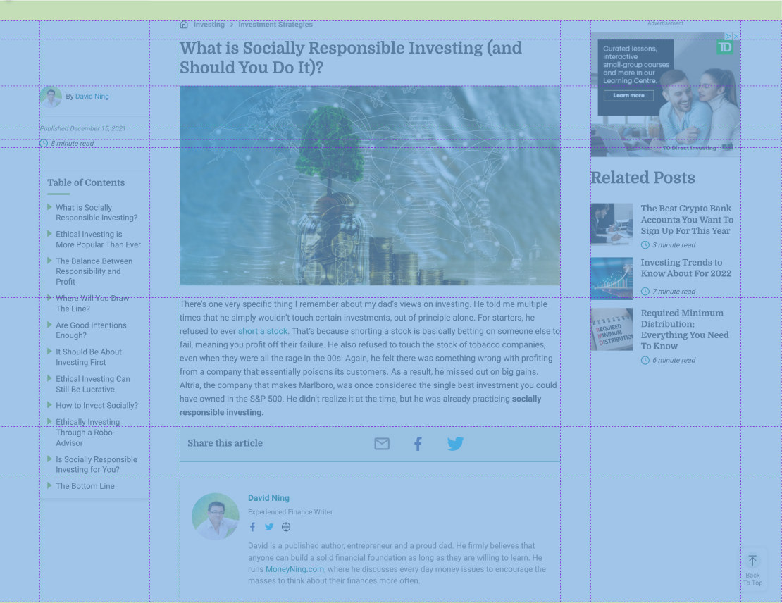
The Grid
For all our unified themes, the article page follows the same base grid. The grid is made up of 7 columns, and 11 rows depending on what elements we wish to show. 3 columns are reserved for UI elements, with 4 for gutters.
Site Width
The maximum width of our unified sites is 1400px. All content should fit within these bounds, and be fully responsive. We always check to make sure our sites are optimized for mobile, tablet, desktop, and everything inbetween. No layout should break. The minimum screen width we test is 375px (iPhone SE), and the maximum is 1400px+ , depending on the size of the desktop monitor.
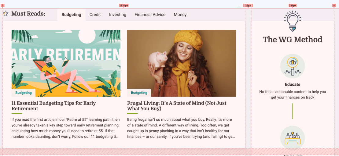
Responsive Grid
For all components, we use a responsive grid that doesn’t follow a rigid grid structure. Some components have 3 or 4 columns, depending on screen size, and scale all the way down to 1-2 columns on mobile. Gutters should be consistent between components.

Mobile

Breakpoints
CSS breakpoints are points where the website content responds according to the device width, allowing you to show the best possible layout to the user. CSS breakpoints are also called media query breakpoints, as they are used with media query.
Our unified theme includes a few set breakpoints such as:
| Breakpoint | Size |
|---|---|
| $sm | 576px |
| $md | 768px |
| $lg | 992px |
| $xl | 1200px |
| $xxl | 1400px |
A general rule is that you should add a new media query whenever a part of the design breaks, and that could be at any screen size (not just these sizes).
Best Practices
- On the article page, we are free to move elements around (eg. The heading can be placed in the 2nd column), but its best to stick to the optimized layout.
- The base font size for typography is 16px. All elements on the page scale based on this font-size.
- When sizing elements, its recommended to use REM units, and stick to quarter units. ie.
0.25rem, 0.5rem, 0.75rem, 1rem. - Whenever possible, make sure that elements line up, both vertically and horizontally.
- Align your bounding box to the grid, not the baseline of your text.
- Use CSS Grid when building a layout in our unified theme. Read more about how to use CSS Grid here.