System1 uses photography in creative and adaptive ways to express our growth mindset, ambitious goals, and passionate people. We use gradients made with our corporate colors paired with images of ambient technology and human interaction for maximum word and image impact. Contrast and accessibility is always top priority whenever we place type on an image. […]
- System1 uses photography in creative and adaptive ways to express our growth mindset, ambitious goals, and passionate people.
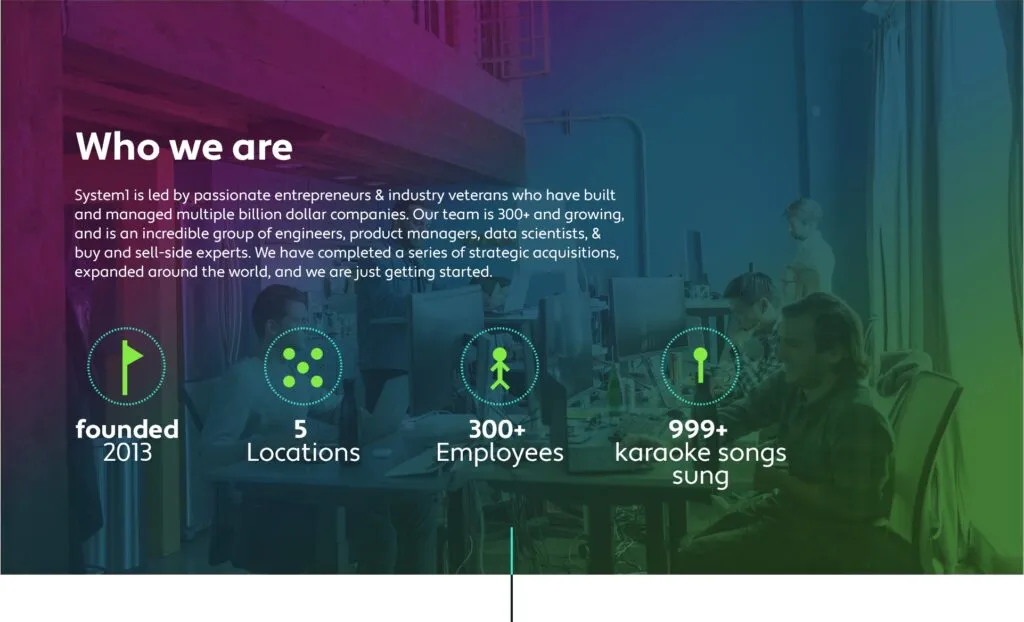
- We use gradients made with our corporate colors paired with images of ambient technology and human interaction for maximum word and image impact.
- Contrast and accessibility is always top priority whenever we place type on an image.
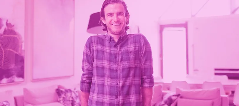
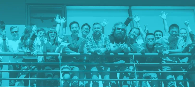
- Solid color overlays in brand colors on desaturated images is our technique used for editorial implementations as seen on system1.com’s careers page.
Examples
Ambient Technology

Text On Image
Editorial
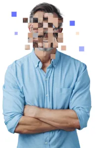
- When showing a person in our ad creatives, a pixelated treatment should be used to represent the user’s anonymity.
- The person is usually cut out from the photo’s original background and placed on a solid color background.
- The face is divided into squares on a grid and rearranged. Solid color blocks with samples from the person’s skin tone are mixed in.
- Additional blocks in shades of the skin tone and brand blue are added to represent the user’s identity fading away.
Blog Photography Treatment & Hero Images
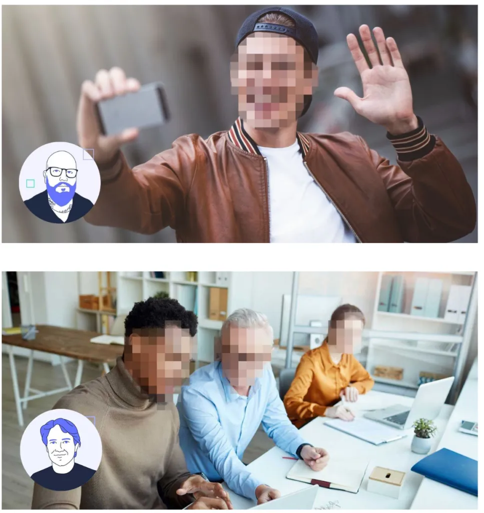
- When showing a person’s face on our blog, a pixelated treatment should be used to represent the user’s anonymity.
- Due to the frequency of the blog posts, a simpler pixelated style is used on our blog images and social creatives. This style can quickly and easily be generated.
- This style simply pixelates only the face of the person or people shown.
The imagery we use across our brand is representative of both our values and our users.
Our product needs to be portrayed as accessible and user-friendly to all.


