A tooltip is a short descriptive message that appears when a user hovers or focuses on an element.
Demo
Note
- These screenshots are taken from Activebeat theme.
- The unified tooltip utilizes Alpine.js for functionality, so this demo is not available.
States & Variations
Default
Hover
Usage
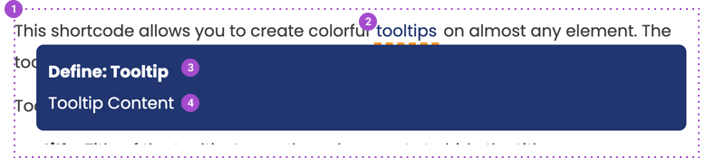
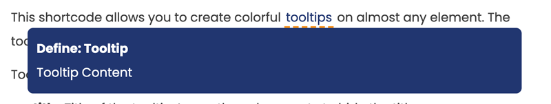
In a Wordpress post, you can add a tooltip by wrapping text with: [unified_tooltip title="Define: Tooltip" tip="Tooltip Content"]tooltips[/unified_tooltip]. The title of the tooltip can be changed within the title attribute, and content with the tip attribute.
Anatomy
- Tooltip
- Tooltip Label
- Tooltip Title
- Tooltip Content