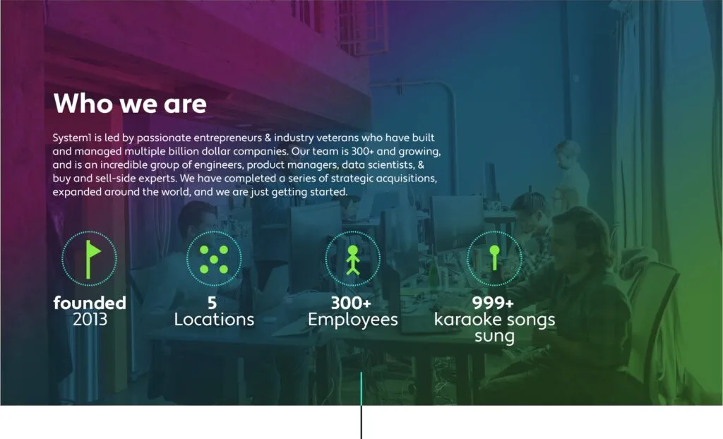
System1 uses photography in creative and adaptive ways to express our growth mindset, ambitious goals, and passionate people. We use gradients made with our corporate colors paired with images of ambient technology and human interaction for maximum word and image impact. Contrast and accessibility is always top priority whenever we place type on an image. […]
- System1 uses photography in creative and adaptive ways to express our growth mindset, ambitious goals, and passionate people.
- We use gradients made with our corporate colors paired with images of ambient technology and human interaction for maximum word and image impact.
- Contrast and accessibility is always top priority whenever we place type on an image.
- Solid color overlays in brand colors on desaturated images is our technique used for editorial implementations as seen on system1.com’s careers page.
Examples
Ambient Technology

Text On Image
Editorial
Brand Resources
Guidelines
- System1 uses fill icons encircled by a decorative dashed stroke
- Icons are filled with either S1 Green or S1 Black
- Stroke should be S1 Blue Green
Examples
Thicker stokes can be used to draw more attention to page headers and title pages.
The icon fill and stroke colors can be changed for another S1 color if more contrast with the background is needed.
Hackathon Badges
- Download our Hackathon Badges
ERG Logos
- View our ERG Logos


