A “card” is a UI design pattern that groups related information in a flexible-size container visually resembling a playing card.
Demo

Lorem ipsum dolor sit, amet consectetur adipisicing elit. Molestiae, veniam qui rem sit cumque quo? Tempore, vitae incidunt. Incidunt in fuga eius, minus ipsam corrupti voluptatum reiciendis pariatur ullam inventore.
Note
- Card styles will vary heavily depending on the child theme. Some variations such as rounded and shadow may be applied to all cards by default.
- Images, buttons and text can be placed inside cards, but will require additional custom styling. The demos on this page are custom to the design guide, but can be referenced while building child themes.
States & Variations
Standard
Card content
Rounded
Card content
Shadow
Card content
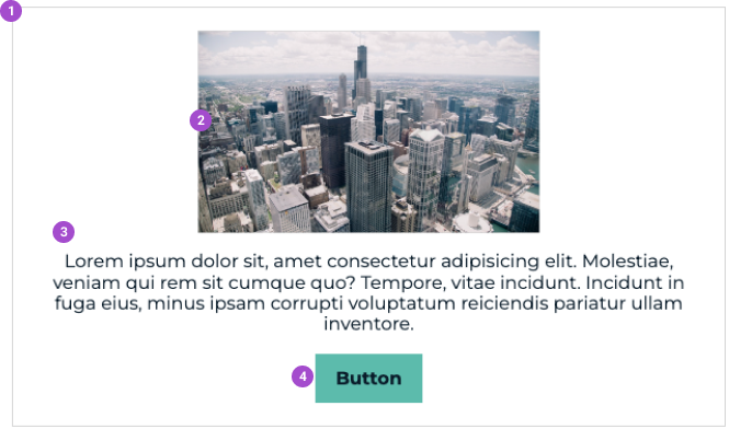
Image, description and button
Lorem ipsum dolor sit, amet consectetur adipisicing elit. Molestiae, veniam qui rem sit cumque quo? Tempore, vitae incidunt. Incidunt in fuga eius, minus ipsam corrupti voluptatum reiciendis pariatur ullam inventore.
Usage
Cards are usually added on a case by case basis. If we want the styles of a card to be applied to certain elements, we can @include a sass mixin called card. This basic mixin is then built upon to add further styling to a 'card'.
Anatomy
- Card
- Card Image
- Card Description
- Card Button