Tables are a design pattern for displaying large amounts of data in rows and columns, making them efficient for doing comparative analysis on categorical objects.
Demo
States & Variations
Responsive
In order to make a table responsive, you will need to add a container around the table, with the CSS class .table-responsive. On mobile devices, or when there are many columns, the table will overflow and allow scrolling.
| Table Heading 1 | Table Heading 2 | Table Heading 3 | Table Heading 4 | Table Heading 5 | Table Heading 6 |
|---|---|---|---|---|---|
| Table Cell | Table Cell | Table Cell | Table Cell | Table Cell | Table Cell |
| Table Cell | Table Cell | Table Cell | Table Cell | Table Cell | Table Cell |
Horizontal Table
In order to make a table appear horizontal, add a CSS class of .table--horizontal to the table element, and modify the markup like the below example.
| Mileage | 30,000 miles |
|---|---|
| Exterior | Storm Blue Metallic |
| Interior | Black |
Stacked Table
In order to make a table appear stacked, add a CSS class of .table--stacked to the table element, and modify the markup like the below example.
| Mileage | 30,000 miles |
|---|---|
| Exterior | Storm Blue Metallic |
| Interior | Black |
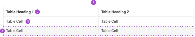
Anatomy
- Table
- Table Header
- Table Cell
- Table Row / Row Odd