To make sure products are accessible to everyone, follow the four principles of the Web Content Accessibility Guidelines:
- Perceivable: It can be perceived by at least one of a person's senses.
- Operable: All interactions are operable through a variation of input methods.
- Understandable: Information and operation of the interface must be understandable.
- Robust: Content can be interpreted by a variety of assistive technologies and withstand changes in these technologies.
Structure and hierarchy
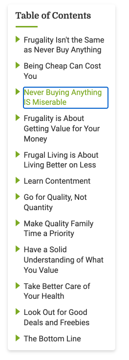
Consistent, clear hierarchy helps people who navigate the page using links or headers. Use headings and titles to outline the page so people can see the structure and how sections relate to each other.

Do
Use a consistent heading hierarchy: H1, H2, H3, H4

Don't
Use headings out of order: H2, H1, H3, H3
Keyboard navigation
Some people can't use a mouse and navigate through applications using tools such as a keyboard, mouth wand, or eye tracking system. People should be able to navigate and use the product with a keyboard or screen reader. Make sure anything that can be seen by hovering with a mouse is also accessible to keyboard focus and screen readers.

Skip links
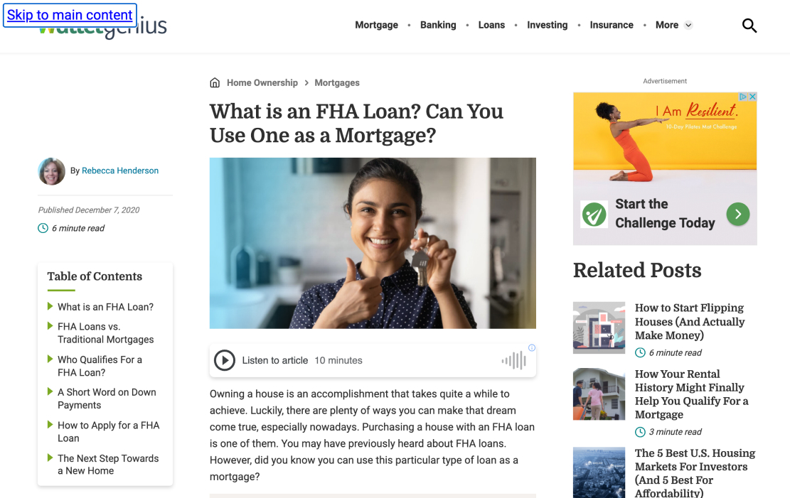
The main content of a web page rarely comes first in a typical layout. There are a number of items users must bypass in order to reach main content, like a website's logo, a site search, and the main navigation. For sighted keyboard users and keyboard users with visual impairments, tabbing through all of these items to reach the main content can be a long and tedious process. Providing a "Skip navigation" or "Skip to main content" link as the first link in the design can save keyboard users time and energy, and eliminate having to hunt for the main content on a web page.

Images
Describe non-text elements in the UI with alternative text so screen readers can properly describe images and media.
If the image is used strictly to make the page pleasant to the eye, doesn't contain a link, and isn't used to deliver information, then include the alt attribute, but leave it empty. For example:
Colors
We comply with AA standard contrast ratios. To do this, we choose primary, secondary and extended colors that support usability. This ensures sufficient color contrast between elements so that people with low vision can see and use our products.
Use high contrast

Do
Use high contrast color combinations that pass AA compliance.

Don't
Don't use low contrast color combinations that fail AA compliance.
Accessible HTML
Always write HTML code with accessibility in mind!
Provide the user a good way to navigate and interact with your site. Make your HTML code as semantic as possible.
Semantic HTML gives context to screen readers, which read the contents of a page out loud.
Use appropriate HTML5
Note
There is so much more to learn about accessibility! We recommend you check out these additional resources:
